

Identity & Language
The brand is a complex ecosystem, comprised of voice, color, image, graphics, illustrations, and typography. Consistency in building and applying the identity across a wide range of touchpoints strengthens Uná's recognition, culture, and experience with its stakeholders.

tone of voice
We bring in our tone a way that is close to the brand with the natural and consequently with people, through affection, comfort and promoting sensory stimuli and reconnection with nature.
We reflect the exploratory spirit of each one, who seeks the best natural product in terms of quality and care throughout its production chain.
In our speech, we can occasionally include more affectionate phrases with words in the diminutive, such as:
Our value proposition is to provide more people with access to organic coffee, whether for a good cup of coffee or for something much more than just filtered coffee.
Using quality organic coffee, we want to create memorable, emotional moments. It's like having a little piece of Fazenda Liberdade in your home, allowing you to take a break and reconnect with what matters most, in a healthy and balanced way.
" Fresh coffee from the farm to your home!"
"That good coffee to start your day"
"A little piece of Fazenda Liberdade in your home."
The explorer's universe can be reinforced with the history of the Farm, as well as the real history of its collaborators, or by bringing elements of the region, the plant, the land.
" Discover what drives us every day to experience the best of coffee for over 100 years"
"With over 100 years of experience and looking to the next 100 , this is how we produce organically, caring for the future of the next generations, the land and the coffee. "
brand versions

The brand has a single signature version, which can vary only between white or black, depending on the application backgrounds.
! Always use the downloadable .png or .eps file. Never try to redesign the logo.
maximum reduction
To protect brand visibility, there are minimum application sizes permitted.
The print and digital media specifications for each subscription are illustrated alongside.

brand integrity
01. protection area
The protection area serves to protect the brand and maintain its graphic integrity when combined
with other elements.
For Uná, use the height of the letter “U” as protection, which is the basis for calculating the protection area.
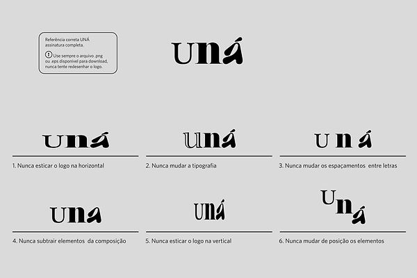
02. incorrect uses
On the side, we graphically represent incorrect uses of signatures.
These rules apply to all Uná brand subscriptions.
Always use the downloadable .png or .eps file. Never try to redesign the logo.
color palette
warm colors:
SALMON
C0 M30 Y55 K0
R250 G193 B128
HEX #FAC180
PANTONE: 7415C
MUSTARD
C 20 M40 Y90 K10
R196 G146 B43
HEX #C4922B
PANTONE: 1245C
BROWN
C35 M65 Y60 K50
R111 G68 B59
#6F443B
PANTONE: 497C
ORANGE
C 0 M80 Y90 K0
R233 G78 B36
#E94E24
PANTONE: 171C
neutral colors:
BLACK
C0 M0 Y0 K100
R0 GO BO
HEX 000000
PANTONE: PROCESS BLACK
WHITE
C0 M0 Y0 K0
R255 G255 B255
HEX FFFFFF
BEIGE
C10 M5 Y15 K0
R235 G236 B223
HEX #EBECDF
PANTONE: 7500C cross-linked
institutional palette
The Uná palette is made up of 3 color patterns:
Neutral colors :
white, black and beige
Warm colors:
mustard, salmon, orange, brown
Cool colors:
mint, blue, green
The preferred color for use is MUSTARD , however, the other colors in the institutional palette can be used freely in brand communication.
Its proper use will ensure memorable recognition at all points of contact.
The codes described here must be used rigorously to ensure color fidelity and help maintain brand consistency.
CMYK and Pantone standards should be used in printed materials. RGB and Hexadecimal
(HEX) in pieces intended to be displayed on some type of electronic screen, such as websites, videos, Instagram and presentations.
cool colors:
DARK BLUE
C90 M45 Y40 K30
R0 G90 B108
#005A6C
PANTONE: 3025C
MINT
C35 M15 Y35 K0
R181 G196 B175
#B5C4AF
PANTONE: 622C
GREEN
C90 M45 Y90 K40
R23 G80 B48
#175030
PANTONE: 553C

signatures in institutional colors
The B&W version of the brand application is for occasional use and is not the priority version.
It can be used in the physical environment, in situations where limitations in graphic resources reduce the number of colors, or when there is a piece with low legibility for the use of the color positive version.
It is recommended to use the negative version to apply the logo under photos.

color versions
positive x negative
The application of the brand on a black or white background is for occasional use and is not the priority version.
It can be used in the physical environment, in situations where limitations in graphic resources reduce the number of colors, or when there is a piece with low legibility for the use of the color positive version.
illustration guidelines

As a guideline for creating illustrations, the examples below were drawn to represent the care taken in the process, from caring for the plant to reaching the customer's cup.
Feel free to use the elements to create more elaborate communication pieces, but without going overboard.
The elements can be applied in the colors of the institutional and complementary palette, therefore, all colors available for the brand, always on solid backgrounds.
photo & image party


institutional
For Uná's photos, always explore a natural setting.
Choose fabrics like linen, cotton, or jute for your compositions, and ceramic cups. Explore natural earthy tones like wood, earth, or clay bases. Or colorful backgrounds with colors from the chromatic palette.
Plants and coffee beans are interesting elements when composing photos, or coffee preparation accessories such as French presses, Hario coffee makers, among others.
For non-product conceptual photos, it's worth exploring:
- images of coffee terroir maps
- photos with documentary footage of the farm and collaborators
- images of coffee shops with baristas and end consumers.
- photos of coffee bags or coffee liquid.
tipografias da marca

titles & highlights
The PLANTAGENET CHEROKE typography was chosen to be used in the titles and highlights of the brand's communication.
It is not recommended to use this typography in very dense texts.

texts
For the running texts, the COPPERPLATE typography was chosen, for its sophistication and lightness.
Utilize the full range of family weights and ensure better information hierarchy.

system
If you need to compose texts in a digital environment that requires the use of system typography,
replace title fonts with TIMES NEW ROMAN and running text with ARIAL.
! The use of these fonts is not preferential. Whenever possible, use the other fonts indicated in the project.

designed by: